Berlinale Bloggers 2024
Greek oregano, Turkish coffee, the Berlin “gob”, and a wolf

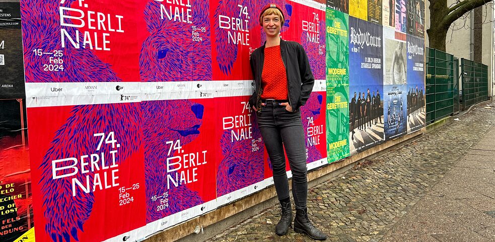
I meet Claudia in the heart of Wedding over a Turkish breakfast, a bunch of Greek oregano in my hand. Claudia presents me with a Berlinale poster – a fair exchange, I reckon. Our waiter sniffs the oregano and joins us for a while to tell us about its various uses as a natural remedy – which we listen to with interest before turning to the subject of the Berlinale. Over hot Menemen eggs, sesame bread rings and Turkish coffee, Claudia tells me what brought her to the Berlinale, and where she got her inspiration for the design of this year’s poster.
By Sofia Kleftaki
The bear as a characteristic symbol of Berlin and the Berlinale not only represents the city, it is also conferred as an award – and has appeared as a recurring element of the key visual year after year.
The bear represents Berlin, and is de facto an important part of the Berlinale as well. If you weren’t already aware, this has certainly been illustrated clearly by the awesome posters produced by Swiss agency Velvet portraying the bear against photographic backdrops on the streets of Berlin – one bear is shown getting off the U-Bahn, another looking down from the Brandenburg Gate. A creative tribute to the city. Admittedly the bear has not always been the main star of the Berlinale posters. In fact posters for the early decades were designed by a graphic artist named Volker Noth, who came up with some very original motifs and photo collages. They were often colourful visual metaphors for film and cinema, showing filmstrips and abstract representations of people.
You’ve been doing the posters since 2021. How did that come about?
In 2017 a good friend of mine founded Wolf Kino, a cinema in Neukölln. To mark the opening, I drew a wolf on a window I found and presented it to her. This wolf still hangs in the cinema bar and has practically become a sort of logo. I’ve belonged to the “wolf pack” since then. Verena von Stackelberg works on the film selection committee for the festival and in 2020 she convinced the Berlinale directors, Carlo Chatrian and Mariette Riesenbeck, to invite me to the pitch and present my poster design for the 2021 Berlinale. I was very excited and did everything within my power to deliver a good design. It was the first time I’d done such a big project.
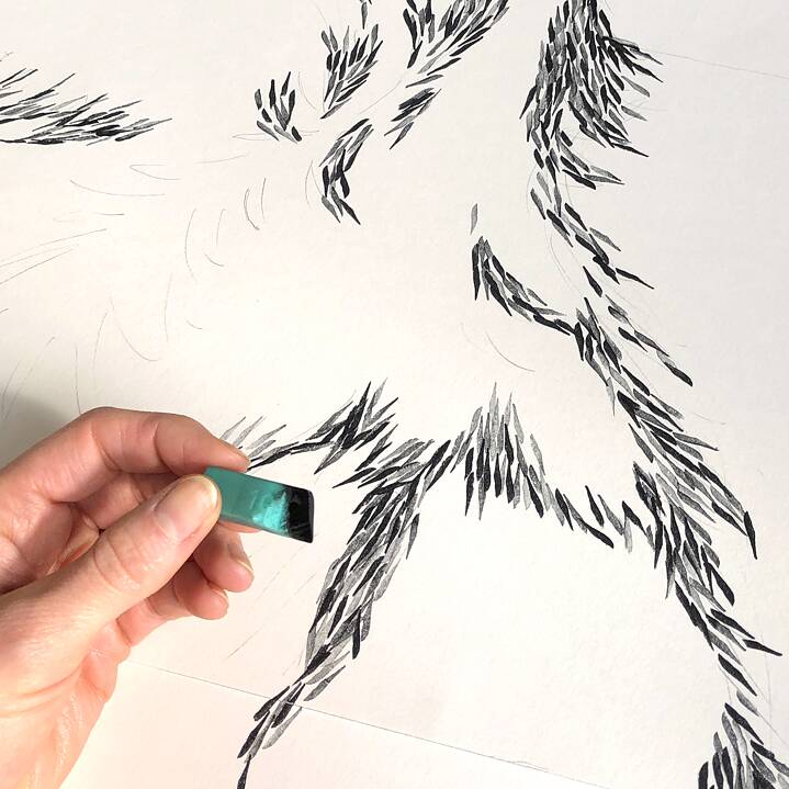
The idea arose from the desire to represent the different perspectives of the Berlinale in an innovative way. The decision to show the bear in fragments, as a kind of puzzle, is meant to symbolise the diversity of the city of Berlin itself, but also of the Berlinale in particular. I find it incredibly exciting and appealing when only a single part of the bear is visible, your imagination does the rest! Apart from that, it means you’re virtually at point-blank range with the bear. With its open, gregarious and above all inquisitive character, the bear is an icon of the dialogue and encounters that make the festival so important and respected. However it also has claws and will not stand idly by in the face of injustice or suffering, and – like the Berlinale – fights the corner of suppressed minorities. I always think it’s important that the work isn’t all done on the computer, but first and foremost created by hand. For this motif I stamped each hair of the bear’s coat individually, using stamps I cut myself from erasers.
The bear was missing in 2023, when the visual focus was on the audience.
That’s right, for the 73rd Berlinale it was explicitly specified that there should be no bear. The bear in previous years had such import that they wanted something else to happen on the posters. The brief was to show Berlin’s solidarity at the Berlinale, to present the city as a special place on the cinema scene. It was a fascinating journey. With a range of inspiration from traditional stamping techniques to digital graphics – I was trying to reflect typical Berlin personalities in all their diversity. The people of this city, their variety and contrasts, they are what makes Berlin so unique. The challenge was to represent this multiplicity as a visual – including of course an assortment of skin colours, people from young to old with differing physical attributes, and an attempt to reflect non-binary sexuality.

Turkish breakfast | © Sofia Kleftaki / Goethe-Institut Athen
What makes Berlin so special to you?
I always try to reflect the Berlin mentality, typically so gruff and direct, in my works as well. I love the Berlin dialect. The citizens of Berlin are frequently just honest – without any unnecessary courtesy. They offer you a bread roll with a blunt “Willst ne Schrippe?” – a question that underscores not only the Berlin charm, but also the city’s authenticity.

Berlin coffee grounds | © Sofia Kleftaki/ Goethe-Institut Athen
After that we take a stroll along the riverside together through the drizzle, and look more closely at the eight poster designs. I see soft fur, sharp claws and a sincere expression – yet a friendly nature and that certain characteristic manner. The posters meticulously capture the Berlin spirit, whilst showing the city’s diversity and urban vibrancy. A tribute to the people who make Berlin what it is – unmistakeable, honest and unique.


