Visual Unearthing
Visualization of Air Quality Using Open Data

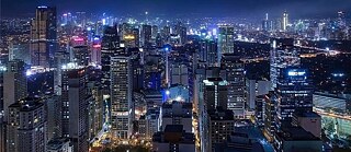
The regional project “Visual Unearthing” by Goethe-Institut Indonesien is dealing with sustainability issues using open data to visualize the air quality pre-pandemic and during the movement restrictions in four major cities in Southeast Asia: Bangkok, Hanoi, Jakarta and Manila.
This project involves researchers from Thailand, Vietnam, Indonesia and the Philippines to ensure the data collection is optimal. For a comprehensive visualization, data used in the project was taken from 2019, 2020 and 2021.
“One of Goethe-Institute’s highest priorities is to address sustainability issues and ecology issues,” says Dr. Ingo Schöningh, Head of Cultural Programs at Goethe-Institut Indonesien.
He added that the project would be a good archive to show the real environmental impact during the COVID-19 pandemic.
Several studies have demonstrated that one of the sources of ambient air pollution in the four cities is motor vehicles. With the implementation of movement restrictions to curb the spread of coronavirus, it is expected that air quality in those cities is improved.
The data to compare the air quality before and during the lockdowns for this project is available for at least 70% of the data inventoried in most cities. However, it does not provide sufficient granularity for detailed analysis.
Michael P. Canares, Strategy Advisor for Step Up Consulting and Research Lead for Visual Unearthing, noted that the data collection process for the project was slightly challenging due to the lack of data in some cities.
“For some countries it’s quite difficult. Among the four cities in the study, it was particularly difficult for Manila and Hanoi,” he said.

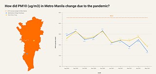
Only data of particulate matter 10 (PM 10) is available for comparison. Particulate matter refers to inhalable particles with a diameter of 10 micrometers and smaller; these particles can cause serious health problems. The particulate matter measurements show that the air quality in Manila is better during the pandemic.
Meanwhile, collecting air quality data in Hanoi is trickier because the government data is not open, not accessible in machine-readable quality, and cannot be downloaded. Additionally, no data is available from past years but rather only current data on a monthly basis.
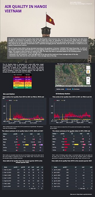
For a sample visualization of Hanoi’s air quality, the study used two data collection points from Gia Lam and US Embassy stations, where historical data is available and downloadable.
The available data display PM 2.5, i.e. fine inhalable particles with diameters of 2.5 micrometers and smaller. PM 2.5 levels seen in both stations decreased during the hard lockdown periods in April 2020 and began to deteriorate when the restrictions were relaxed in the third quarter of 2020.

The air quality data is the most advanced in Bangkok because the data was accessible, collected regularly, and taken at different points throughout the capital city. This enables a comprehensive straightforward comparison to show when mobility was significantly less during hard lockdown periods. The city’s PM 2.5 levels were generally below the baseline figures except for December and January 2020.
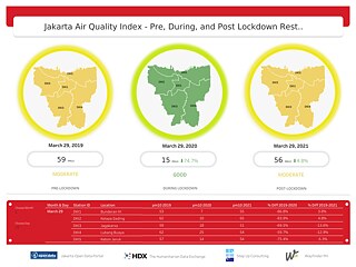
In Jakarta the data is also available but lacks consistency when it comes to particulate matter. Some monitoring stations can have either data of only PM 2.5 or PM 10. Nevertheless, it is possible to make date-to-date comparisons from 2019 to 2021 to specifically show whether the air was cleaner when a hard lockdown was imposed in March 2020.

Nana Karlstetter, Co-Programmer of Visual Unearthing, said that open data can tell a lot about the environment and is valuable to research institutes, governments and the public to get a clearer picture of their surroundings.
“It’s possible to use the visualizations we made to better understand how humankind is involved in the state of the environment,” she said.
As a result, it is expected that more datasets will be licensed for open access, machine-readable, and compiled regularly to facilitate in-depth analysis and more effective decision-making.